Nuxt.js Cheat Sheet

In this article, we will looking into some of the Nuxt essential and how we can use them in our application. It’s advisable to understand the basic of Vuejs before moving into Nuxt js. Before we start with our Nuxt Js Cheat Sheet, lets learn about Nuxt.
Nuxt.js is a free and open source web application framework based on Vue.js, Node.js, Webpack and Babel.js. The framework is advertised as a “meta-framework for universal applications”
Lets look at some of the essentials in Nuxt:
Installation of Nuxt Js
You can setup a new Nuxt projectby using the Nuxt toolkit of by setting it up from scratch.
- Setting up using the Nuxt toolkit:
    npx create-nuxt-app <name of project>
    cd <name of project>
    npm install #installs the project default dependencies
npm run dev # serves the application on a local port- Setting up from scratch:
        Create a `package.json` file and add this code:
    {
    "name": "stater app",
    "scripts": {
      "dev": "nuxt"
    }
    }
After doing this, run npm install --save nuxt to store the Nuxt dependency and then run npm run dev to serve the application.
Nuxt Directory Structure
Assets: This folder contains uncompiled assets and files like sass and lessStatic: This directory contains unchanged files like pictures and text filesComponents: This is where we store all our reusable components.layout: Nuxt also comes with the ability to create multiple layouts for an applicationMiddlewares: This is where we write functions that will run before a page is loadedPages: This directory is used by Nuxt for routing.Plugins: This is where we configure all our Js plugins such as sweetalert, CarouselStore: All Vuex files are kept here for state management.
Nuxt Components
- Routing: Just like using
router-linkin Vuejs for routing, we can also usenuxt-linkfor routing in a nuxtjs application. We can also route to dynamic routes:
<nuxt-link :to="'/cats' + cat.id">Get Cat By Id</nuxt-link>- Nuxt-child : This is used to display child component route in a nested route:
    <template>
      <div>
        <h1>I am the parent view</h1>
        <nuxt-child />
      </div>
</template>;- Error Pages: Nuxt gives the ability tp create custom error pages for displaying errors in a better format. You can get to display errors based on their error codes and error messages. To create this page, create an
error.vuepage inside the pages directory and store this codes:
    <template>
     <h1 v-if="error.statusCode === 500">
     Something Went wrong
     </h1>
     <h1 v-else>An error occurred</h1>
     <nuxt-link to="/">Home page</nuxt-link>
    </template>
    <script>
    export default {
     props: ['error'],
     layout: 'error'
    }
</script>- Layouts: You can define custom layouts for different pages. It’s as easy as create a simple vuejs component:
    <template>
      <div class="container">
        <nuxt />
      </div>
</template>- Vuex Store: We also have the ability to use the Vuex store in our component for state management. Nuxt also automatically adds Vuex to your project components, meaning that we don’t have to import them. We can use them in this manner :
    <template>
     <button @click="$store.commit('increment')">
     {{ $store.state.counter }}
     </button>
    </template>
The Nuxt Config File
Nuxt comes with a config file. It is pre-populated based on the config when creating a new Nuxt project using the Nuxt toolkit. This is a sample format of a nuxt.config.js file:
    export default {
        css: [
            'bulma/css/bulma.css',
            '~/css/main.css'
        ],
        generate: {
            routes: function () {
                return [
                    '/users/1',
                    '/users/2',
                    '/users/3'
                ];
            }
        },
        loading: '~/components/loading.vue',
        head: {
            meta: [{
                    charset: 'utf-8'
                },
                {
                    name: 'viewport',
                    content: 'width=device-width, initial-scale=1'
                }
            ],
            link: [{
                rel: 'stylesheet',
                href: 'https://font.com',
            }]
        },
        plugins: ['~/plugins/vue-notifications']
    }
This config helps us configure our application files such as plugins, html head element, style sheets, javascript CDN etc.
Nuxt Deployment Methods
Nuxt.js lets us choose between three modes to deploy our application:
- Universal,
- Static Generated
- SPA(single page application).
SPA
This mode organizes our project using convention over configuration folder structure and config files. To use this mode, change the mode in the nuxt.config file to spa.
Static
This mode lets pages get pre-rendered into HTML and have a high SEO and page load score. The content is generated at build time.
Universal
This mode execute your JavaScript on both the client and the server it is also know as SSR(server side rendering). All routes have high SEO and page load score. Dynamically get routes rendered on the server before being sent to client.
Vue Cheat Sheet
Hope you liked our Nuxt Cheat Sheet. We also have written an article on Vue Cheat Sheet, you can check that from here – https://www.wrappixel.com/vue-cheet-sheet/
WrapPixel's Vue Templates
We at WrapPixel, offers high quality admin dashboard templates in Angular, React, Boostrap and Vuejs. You can check our latest vue admin dashboard templates and use it in your project to save time and money.
This article is originally posted at WrapPixel - https://www.wrappixel.com/nuxt-js-cheat-sheet/
How to use Bootstrap 4 with Angular 10 & Top 5 Free Angular Bootstrap Resources

In this article, we are going to see different ways to install bootstrap 4 into our Angular 10 application. By following this guide you will learn how to use bootstrap 4 with Angular 10. If you don’t have angular 10 installed on your local machine, you can see this tutorial on how to install it.
Prerequisites
- Familiarity with HTML, CSS, and JavaScript (ES6+).
- Vs code or any code editor installed on your development machine.
- Basic knowledge of Angular
Setting up our Angular Bootstrap application
We will start by setting up a new Angular application using the Angular’s CLI. To do this, create a directory and open up your terminal in that directory:
ng new bootstrap-angular
Running this command will prompt some question for the installation. type N to remove angular routing and select css as the stylesheet format for our application.
After installation, we into the project directory by typing cd bootstrap-angular on your terminal.
Bootstrap consist of the bootstrap’s core script and jQuery. We will use npm to install and setup this package. To do this open up your terminal and run this command. Ensure that you are on your projects working directory):
npm install --save bootstrap jquery
After installation we have to add this to our angular package.
The first method is by adding it in our angular.json file. Open up the angular.json file and import it in the styles and script array:
"styles": [
              "src/styles.css",
              "./node_modules/bootstrap/dist/css/bootstrap.css"
            ],
            "scripts": [
              "./node_modules/jquery/dist/jquery.js",
              "./node_modules/bootstrap/dist/js/bootstrap.js"
            ]
This will add the bootstrap script and styles into our application. With this done we can now try bootstrap components by modifying our codes in our src/app/app.components.html file to this:
<section>
  <div class="container">
    <div class="row">
      <div class="col-md-12">
        <!-- testing buttons -->
        <button class="btn btn-primary">Hello World</button>
        <div
          class="alert alert-warning alert-dismissible fade show"
          role="alert"
        >
          <strong>Hi..</strong> I'm Sunil..I write Angular
          <button
            type="button"
            class="close"
            data-dismiss="alert"
            aria-label="Close"
          >
            <span aria-hidden="true">×</span>
          </button>
        </div>
      </div>
    </div>
  </div>
</section>
We can open our application by running ng serve on our terminal. This will open up our application on port 4200:

Using Bootstrap CDN method
Another way of adding bootstrap in our application is by adding the bootstrap CDN in our root index.html file. To confirm that this is working, you can remove the code you added in the angular.json file. Modify the src/index.html file to this:
<!doctype html>
<html lang="en">
<head>
  <meta charset="utf-8">
  <title>BootstrapAngular</title>
  <base href="/">
  <meta name="viewport" content="width=device-width, initial-scale=1">
  <link rel="icon" type="image/x-icon" href="favicon.ico">
  <link rel="stylesheet" href="https://stackpath.bootstrapcdn.com/bootstrap/4.5.2/css/bootstrap.min.css"
    integrity="sha384-JcKb8q3iqJ61gNV9KGb8thSsNjpSL0n8PARn9HuZOnIxN0hoP+VmmDGMN5t9UJ0Z" crossorigin="anonymous">
</head>
<body>
  <app-root></app-root>
  <script src="https://code.jquery.com/jquery-3.5.1.slim.min.js"
    integrity="sha384-DfXdz2htPH0lsSSs5nCTpuj/zy4C+OGpamoFVy38MVBnE+IbbVYUew+OrCXaRkfj" crossorigin="anonymous">
  </script>
  <script src="https://cdn.jsdelivr.net/npm/popper.js@1.16.1/dist/umd/popper.min.js"
    integrity="sha384-9/reFTGAW83EW2RDu2S0VKaIzap3H66lZH81PoYlFhbGU+6BZp6G7niu735Sk7lN" crossorigin="anonymous">
  </script>
  <script src="https://stackpath.bootstrapcdn.com/bootstrap/4.5.2/js/bootstrap.min.js"
    integrity="sha384-B4gt1jrGC7Jh4AgTPSdUtOBvfO8shuf57BaghqFfPlYxofvL8/KUEfYiJOMMV+rV" crossorigin="anonymous">
  </script>
</body>
</html>
If this doesn’t work immediately, you will have to restart your application to see the changes.
Using ng-bootstrap method
Another good method is by using the ng-bootstrap widget. This has all the bootstrap components that we can use in our application.
To install it open up your terminal and type the following:
ng add @ng-bootstrap/ng-bootstrap
Using ng add configures the package for which makes work easier. Now we can test our component by modifing our src/app/app.component.html file to this:
<section>
  <div class="container">
    <div class="row">
      <div class="col-md-12">
        <ul ngbNav #nav="ngbNav" class="nav-tabs">
          <li ngbNavItem>
            <a ngbNavLink>First</a>
            <ng-template ngbNavContent>First content</ng-template>
          </li>
          <li ngbNavItem>
            <a ngbNavLink>Second</a>
            <ng-template ngbNavContent>Second content</ng-template>
          </li>
        </ul>
        <div [ngbNavOutlet]="nav"></div>
      </div>
    </div>
  </div>
</section>
We can add some bootstrap components into our application by using their specific component.
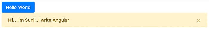
Alert Component
<section>
  <p>
    <ngb-alert [dismissible]="false">
      <strong>Warning!</strong> Sunil is Here for more Angular Templates and Tips
    </ngb-alert>
  </p>
</section>
Here the alert component can be accessed using ngb-alert


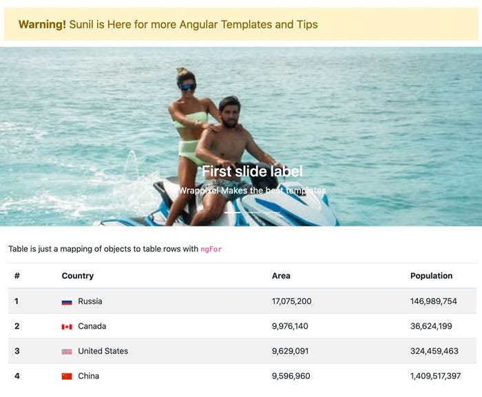
Carousel Component
<section>
  <ngb-carousel>
    <ng-template ngbSlide>
      <div class="picsum-img-wrapper">
        <img
          src="https://images.pexels.com/photos/5103656/pexels-photo-5103656.jpeg?auto=compress&cs=tinysrgb&dpr=2&w=500"
          alt="Random first slide" height="600" width="100%" style="object-fit: cover;">
      </div>
      <div class="carousel-caption">
        <h3>First slide label</h3>
        <p>Wrappixel Makes the best templates</p>
      </div>
    </ng-template>
    <ng-template ngbSlide>
      <div class="picsum-img-wrapper">
        <img
          src="https://images.pexels.com/photos/3048196/pexels-photo-3048196.jpeg?auto=compress&cs=tinysrgb&dpr=2&w=500"
          alt="Random second slide" height="600" width="100%" style="object-fit: cover;">
      </div>
      <div class="carousel-caption">
        <h3>Second slide label</h3>
        <p>I am Sunil, I can give you cool Frontend Templates and Tips</p>
      </div>
    </ng-template>
    <ng-template ngbSlide>
      <div class="picsum-img-wrapper">
        <img
          src="https://images.pexels.com/photos/6010/sea-beach-holiday-vacation.jpg?auto=compress&cs=tinysrgb&dpr=2&w=500"
          alt="Random third slide" height="600" width="100%" style="object-fit: cover;">
      </div>
      <div class="carousel-caption">
        <h3>Third slide label</h3>
        <p>Praesent commodo cursus magna, vel scelerisque nisl consectetur.</p>
      </div>
    </ng-template>
  </ngb-carousel>
</section>
The bootstrap carousel component can be accessed using ngb-carousel. Each of the carousel has an ngbSlide attribute.
Tables
We can also work with table as this is one the core component in bootstrap. To use it, we will define some dummy data in our src/app/app.component.ts file:
import { Component } from "@angular/core";
interface Country {
  name: string;
  flag: string;
  area: number;
  population: number;
}
const COUNTRIES: Country[] = [
  {
    name: "Russia",
    flag: "f/f3/Flag_of_Russia.svg",
    area: 17075200,
    population: 146989754,
  },
  {
    name: "Canada",
    flag: "c/cf/Flag_of_Canada.svg",
    area: 9976140,
    population: 36624199,
  },
  {
    name: "United States",
    flag: "a/a4/Flag_of_the_United_States.svg",
    area: 9629091,
    population: 324459463,
  },
  {
    name: "China",
    flag: "f/fa/Flag_of_the_People%27s_Republic_of_China.svg",
    area: 9596960,
    population: 1409517397,
  },
];
@Component({
  selector: "app-root",
  templateUrl: "./app.component.html",
  styleUrls: ["./app.component.css"],
})
export class AppComponent {
  title = "bootstrap-angular";
  countries = COUNTRIES;
}
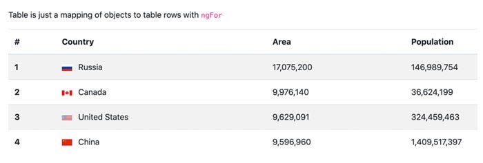
And then define our template in the src/app/app.component.htm file:
<section>
      <div class="container">
        <div class="row">
          <div class="col-md-12">
            <p>Table is just a mapping of objects to table rows with <code>ngFor</code></p>
            <table class="table table-striped">
              <thead>
                <tr>
                  <th scope="col">#</th>
                  <th scope="col">Country</th>
                  <th scope="col">Area</th>
                  <th scope="col">Population</th>
                </tr>
              </thead>
              <tbody>
                <tr *ngFor="let country of countries; index as i">
                  <th scope="row">{{ i + 1 }}</th>
                  <td>
                    <img [src]="'https://upload.wikimedia.org/wikipedia/commons/' + country.flag" class="mr-2"
                      style="width: 20px">
                    {{ country.name }}
                  </td>
                  <td>{{ country.area | number }}</td>
                  <td>{{ country.population | number }}</td>
                </tr>
              </tbody>
            </table>
          </div>
        </div>
      </div>
    </section>

We can put all our components together to build awesome websites.

You can go on and explore all your Bootstrap 4 components in your application after setting this up.
Top 5 Free Angular Bootstrap Templates for every developer
Here we have listed some great angular templates, which are free to download and use for your project. Go check them out.
Monster Free Angular Bootstrap Dashboard

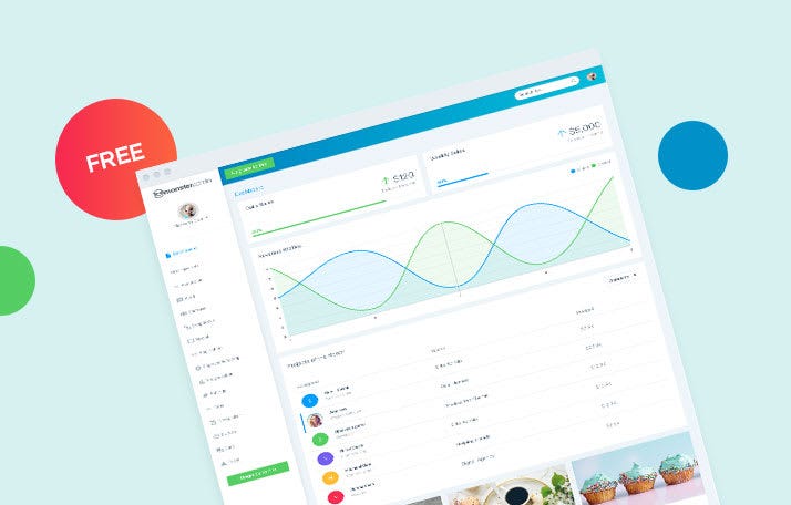
To get your hands on the cutting edge angular admin template free, WrapPixel offers Monster Angular Lite to download at no extra cost. One of the simplified and clean designed templates has a lot of fascinating features for the best user experience.
Being a prominent template offers fully responsive pages with a bunch of features like pages template, UI components, dashboard, table examples, 100+ font icons, chart options, regular updates and a lot more. An admin panel angular template free download that offers customization options, amazing colors is based on Angular framework and SaSS Base CSS. Looking to get the advanced features for your commercial projects? WrapPixel exclusively offers a premium version of this template to get the complete experience of exciting features powered by the Angular latest version.
- Live Preview of Monster Angular Dashboard Lite
- Download Monster Angular Dashboard Lite
- Check Premium version for tons of new features
AdminPro Angular Admin Lite

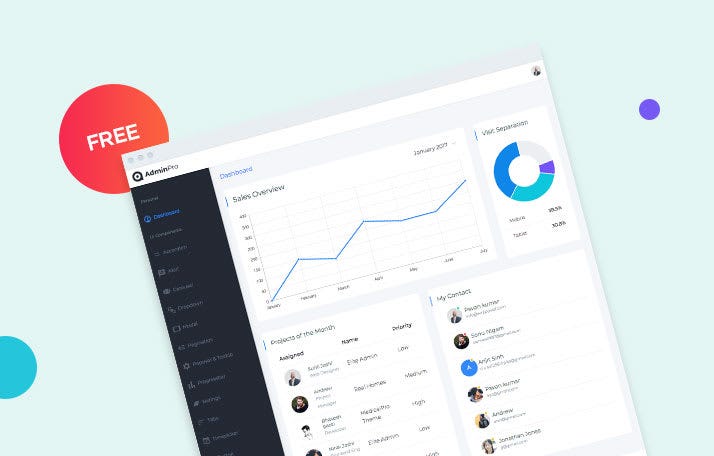
Just imagine, what if you get 7+ page templates, 10+ UI components, 10+ integrated plugins, ready-to-use widgets, creative 100+ font icons, and regular updates all for free with admin dashboard angular? AdminPro Angular Lite does exactly that by providing essential components at no extra cost.
The essential components, elements, and widgets provided by free angular dashboard templates are resourceful, lucrative and helps you to create stunning as well as high-performing admin dashboards for all your projects. To get all the features right away you can purchase the pro version of this template for commercial projects that will not only improve the customer experience but also simplify your development process.
- Live Preview of AdminPro Angular Admin Lite
- Download AdminPro Angular Admin Lite
- Check Premium version for tons of new features
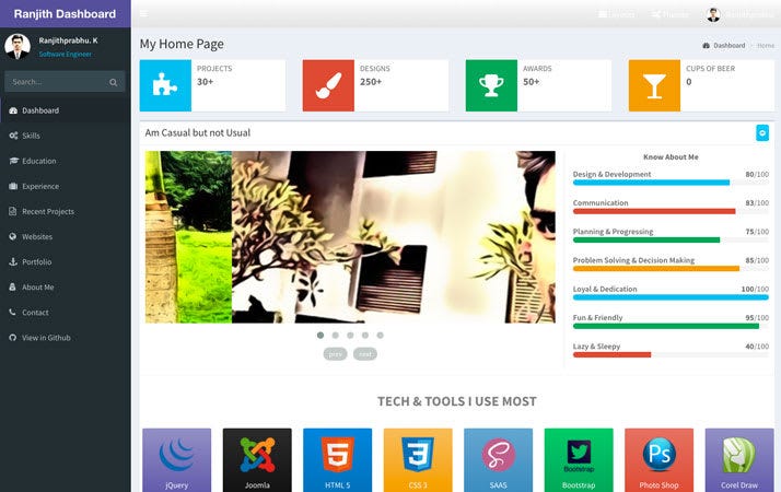
Ranjith Angular Bootstrap

Angular Bootstrap Dashboard is a web dashboard application based on Bootstrap and AngularJS. All components included in this dashboard template has been developed to bring all the potential of HTML5 and Bootstrap plus a set of new features (JS and CSS) ideal for your next dashboard admin theme or admin web app project.
Bknds Dashboard

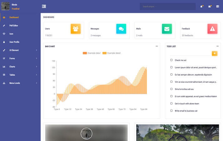
Bknds is easy to use admin dashboard based on angular bootstrap. You can download from github and use it in your projects. It comes with light and dark color mode and few ready to use page templates. It might be good fit for your admin panel.
Xtreme Free Angular Bootstrap 4 Admin

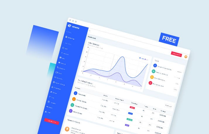
Is your priority vibrant colors and budget both at the same time? Xtreme Angular Admin Lite is a free angular clean design admin template that offers fully responsive pages along with instant customization options to give a personal touch to your admin dashboard. This particular template offers features like page templates, chart options, mini sidebar version, UI components, stunning font icons, flexibility with design and much more for your personal as well as commercial projects.
It is based on the Angular framework and SaSS Base CSS with a modular approach making it the most acclaimed dashboard modular design admin template. To get the complete edge over the advanced features WrapPixel offers a pro version with outperforming features just for you.